SACRED EARTH JOURNEY
Brand Identity
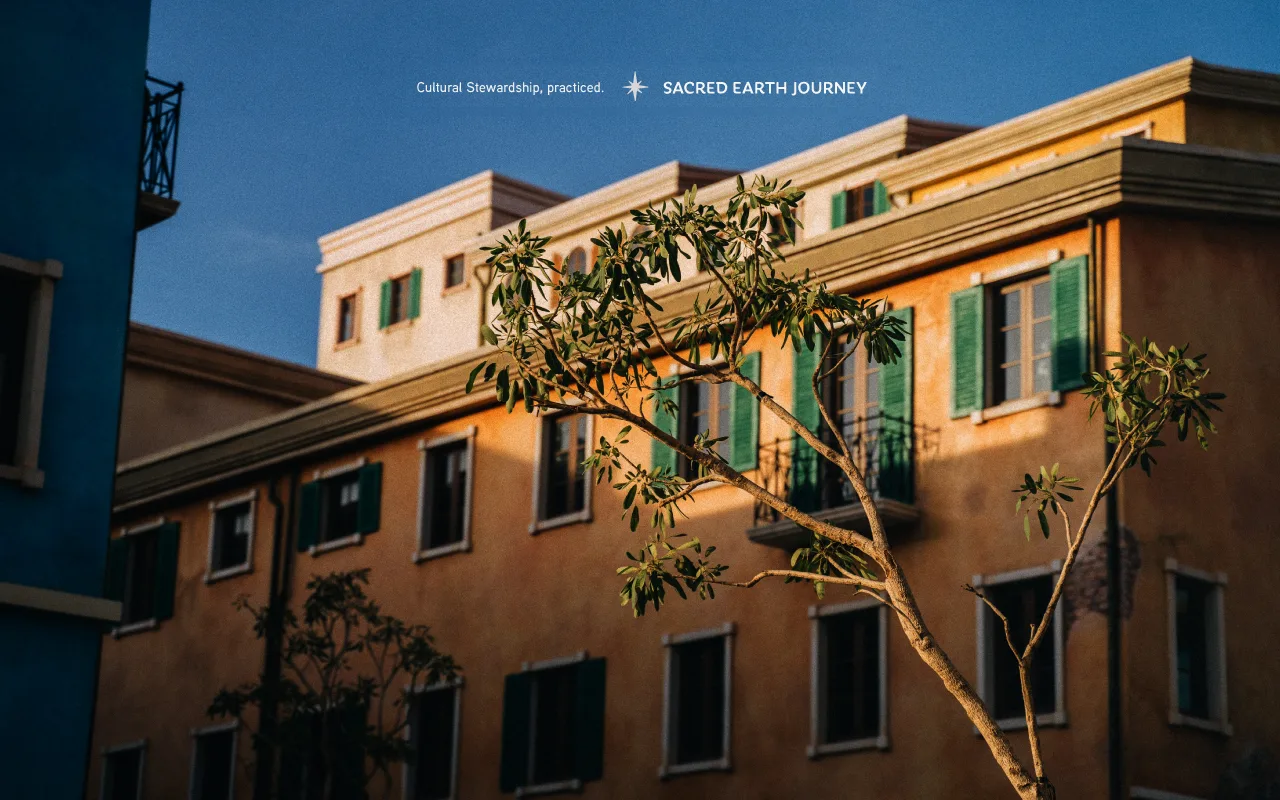
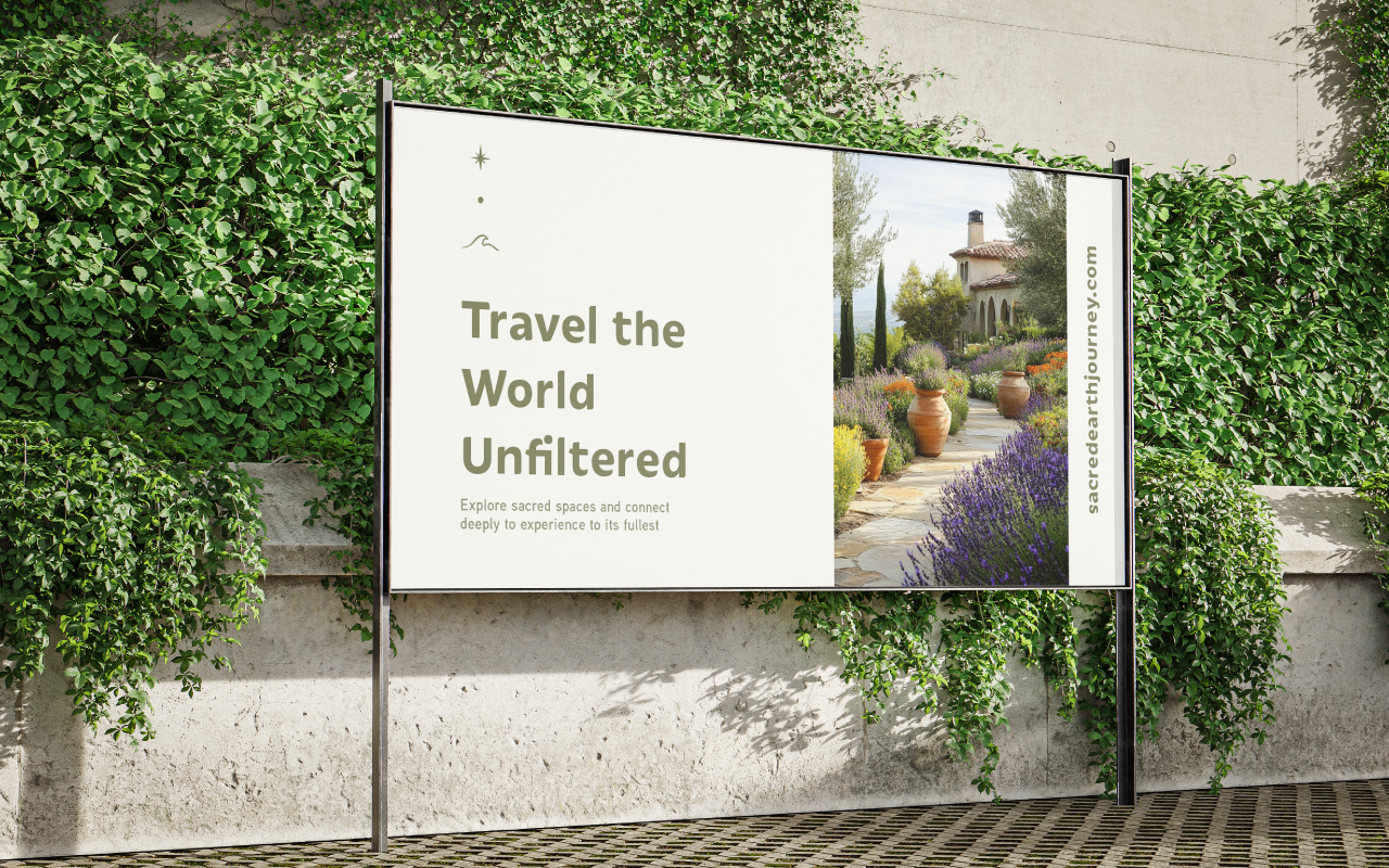
Sacred Earth Journey runs slow, small-group cultural trips across the Mediterranean, Middle East, and North Africa. Groups of 5 to 10 travelers cook with families, share tea, visit sacred places, and reflect each night. Phones are set aside. People connect.
The founders had a clear idea and a detailed brief for the logo, but they needed someone to turn that brief into a practical visual system. The brand had to feel sacred, grounded, and global, without copying any single culture or looking like a travel ad.

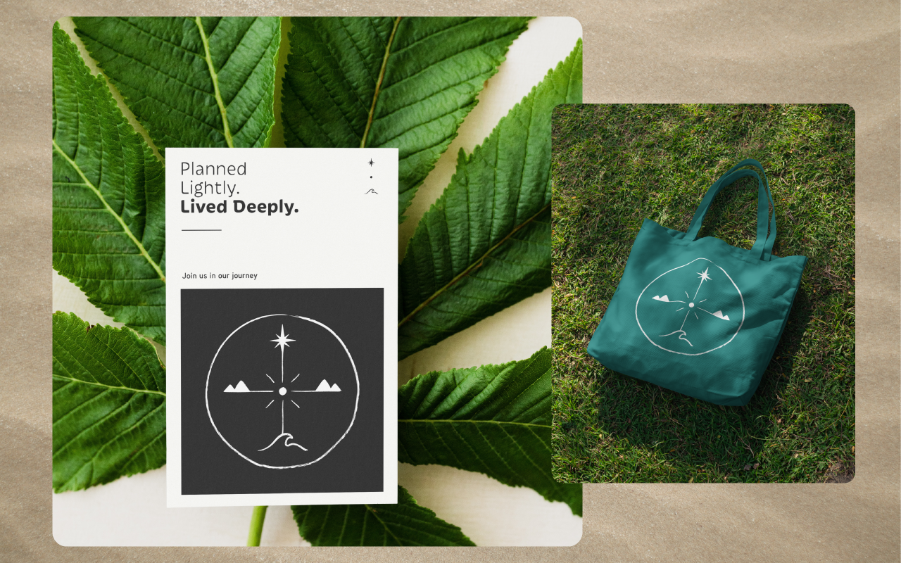
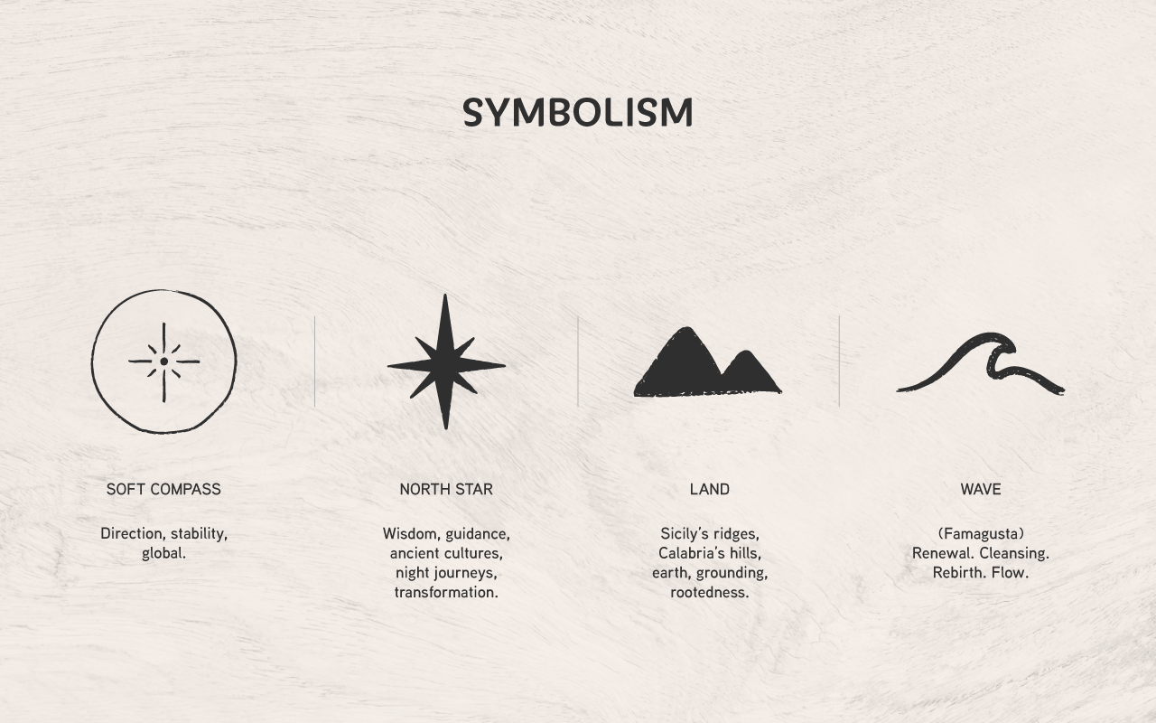
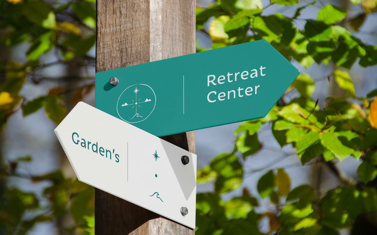
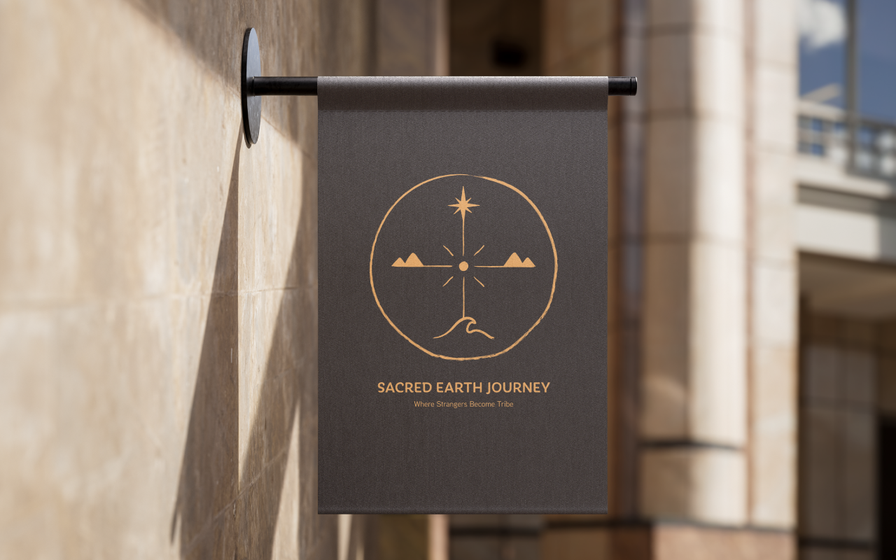
The client described a symbol called the Sacred Earth Compass. They wanted an imperfect hand-drawn circle with a soft compass rose, a north star for guidance, a gentle wave at the south for renewal, and mountain lines to the east and west for grounding. They also asked for stamp, tattoo, and minimal icon versions, plus a calm, timeless look.
I turned the brief into a clean, practical brand system.
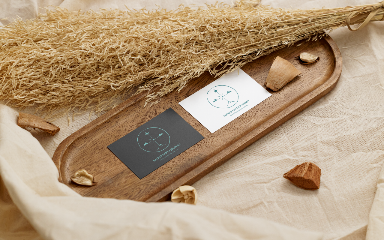
Built the Sacred Earth Compass with organic lines and a clear visual hierarchy.
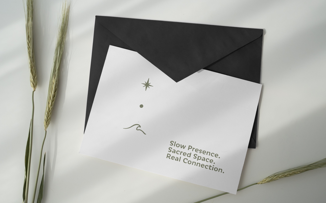
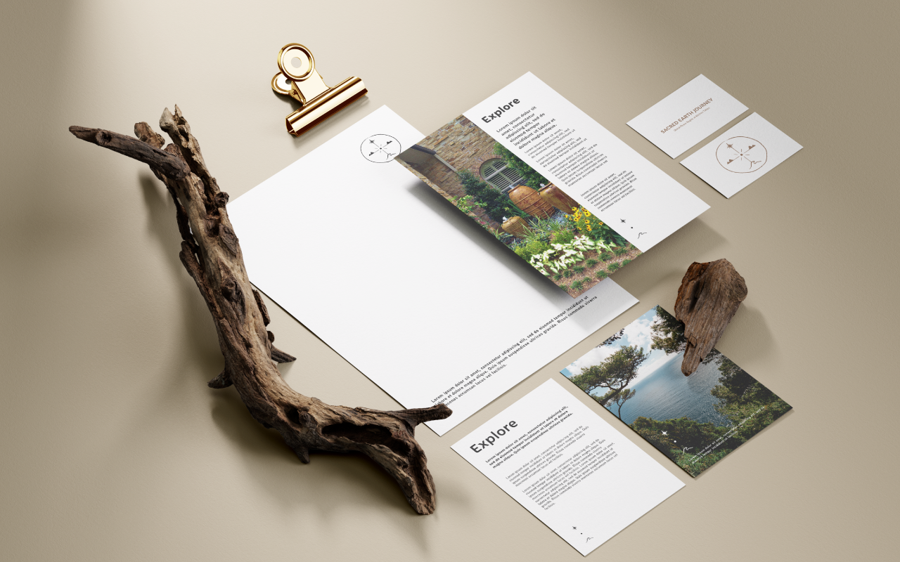
Created multiple logo versions for print, digital, stamp, and icon use.
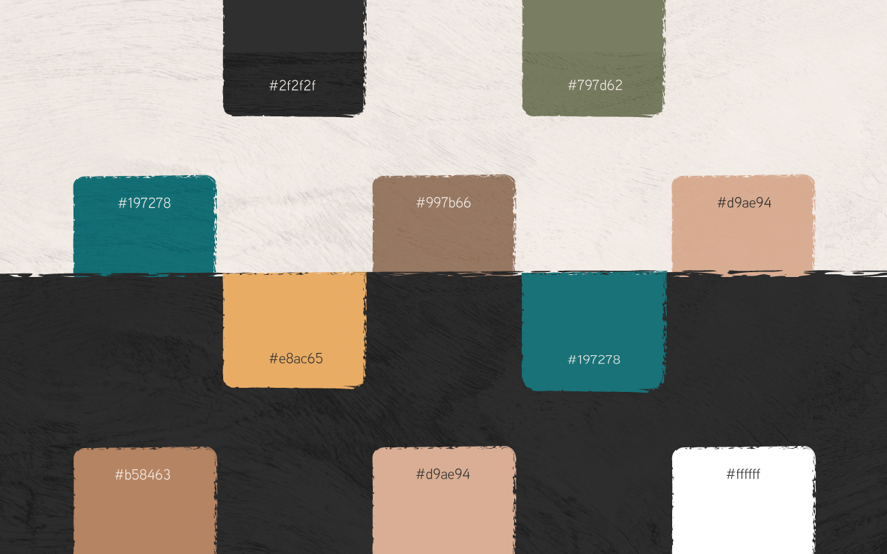
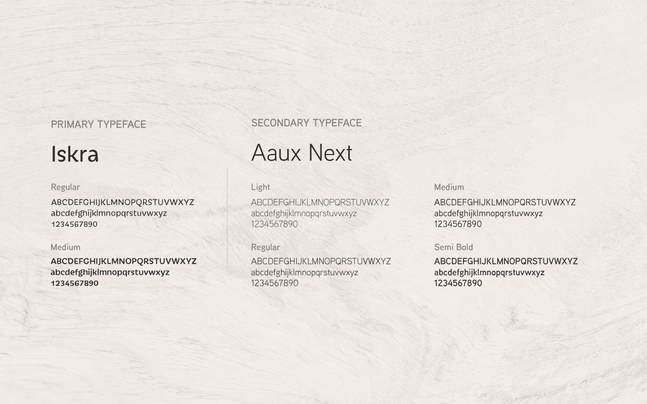
Selected a calm editorial type and a palette rooted in earth tones.
Packaged all assets with simple usage rules so the team can apply the brand easily.